

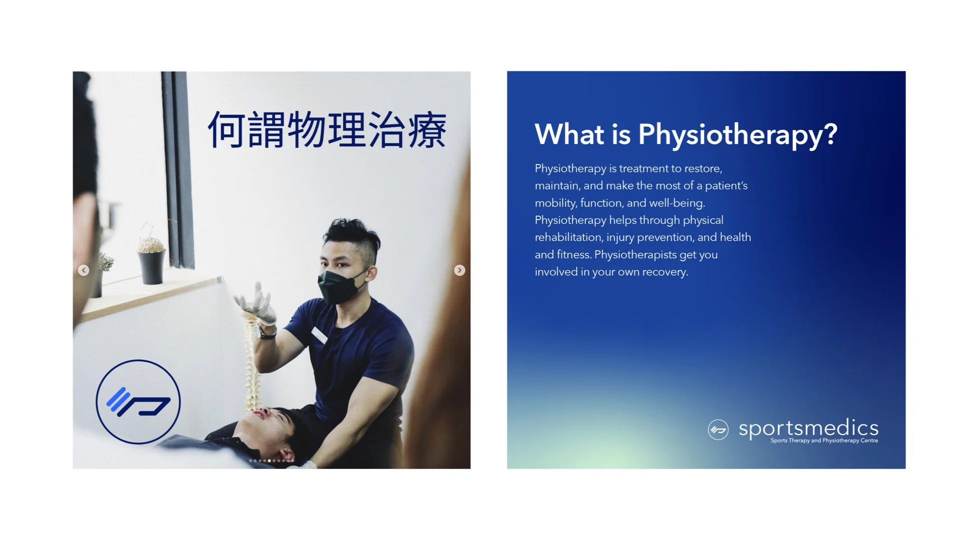
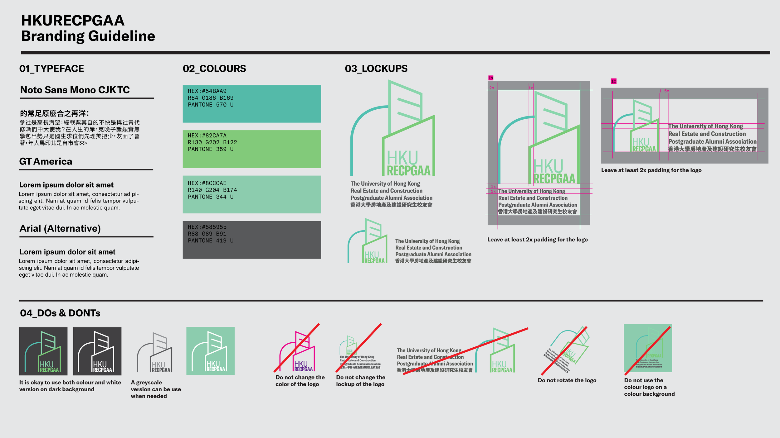
Sportsmedics
Sportsmedics, a pioneer in physiotherapy and rehabilitation, is poised to elevate its brand presence, reflecting its commitment to holistic health, and advanced therapeutic techniques. This branding project aims to rejuvenate both the visual and physical representation of Sportsmedics to resonate more profoundly with current and potential clients.

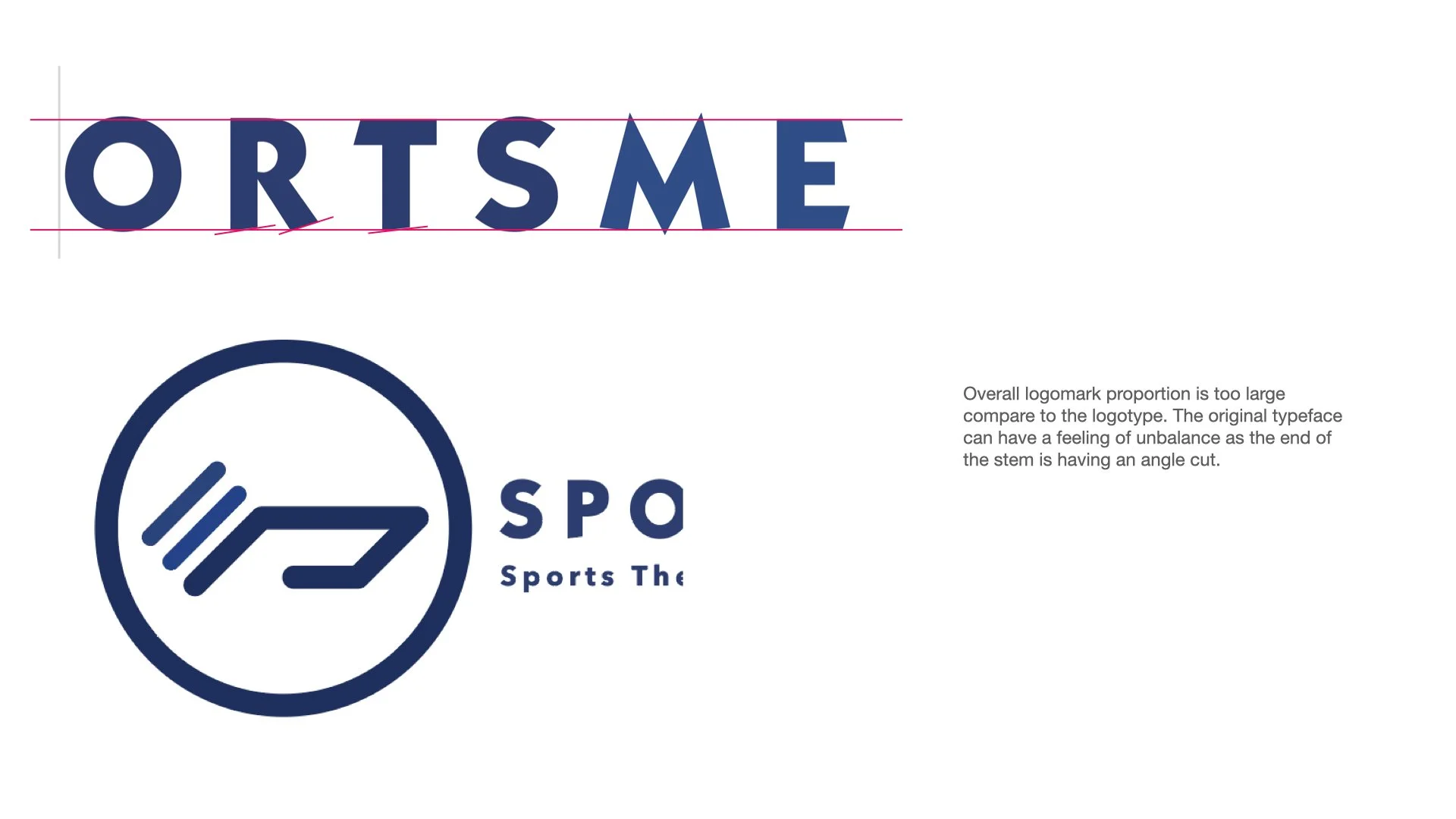
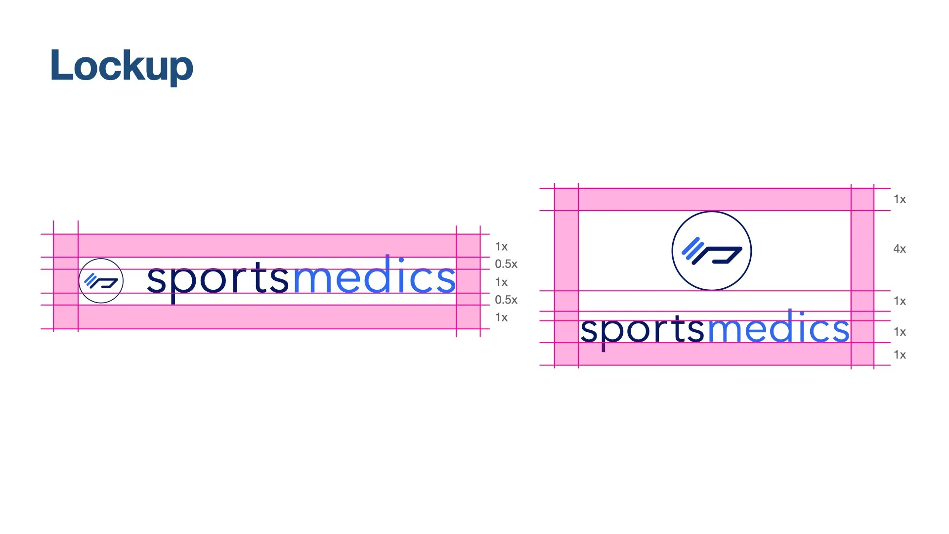
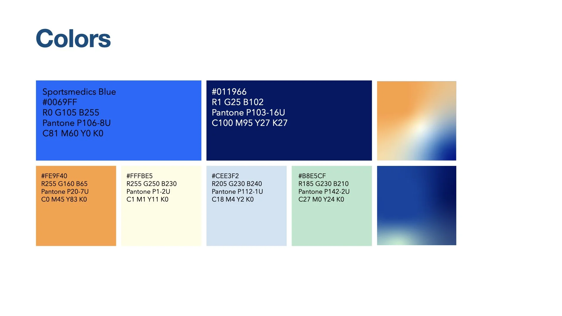
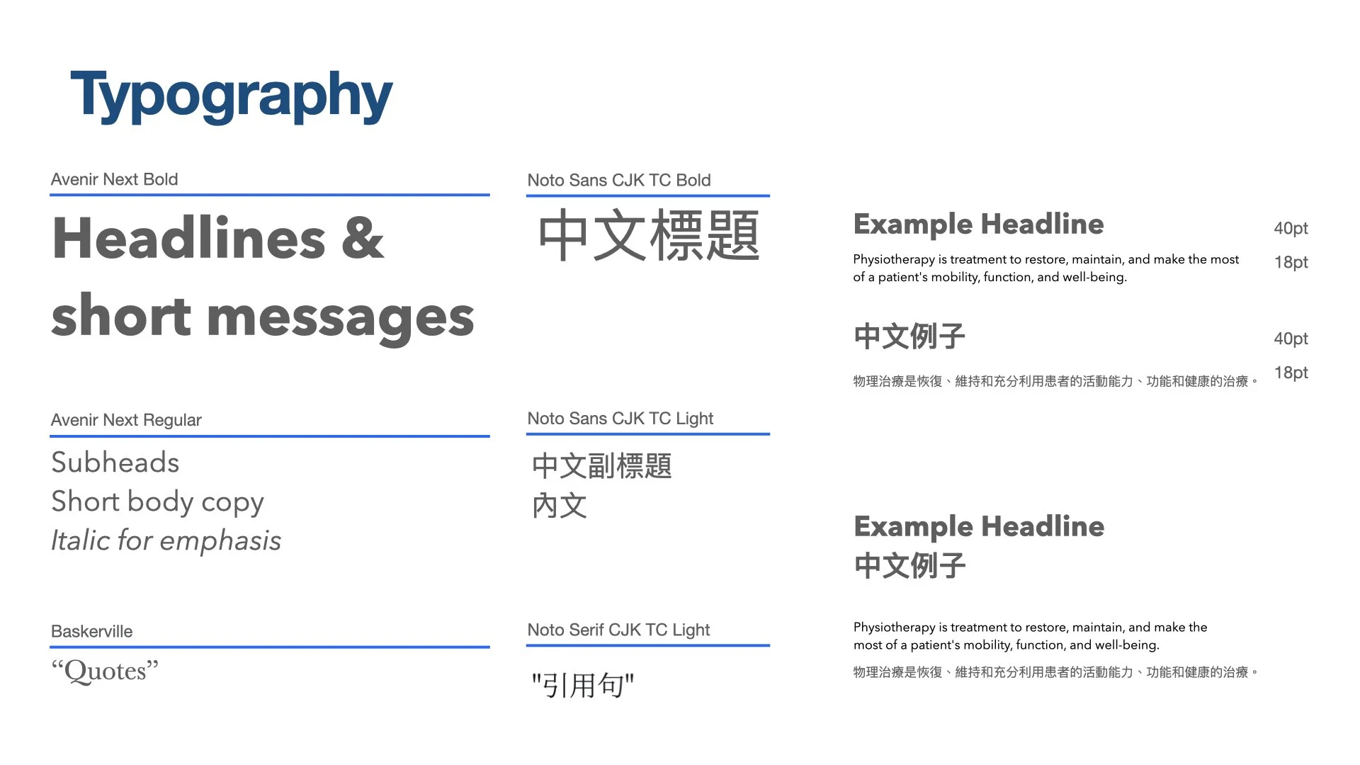
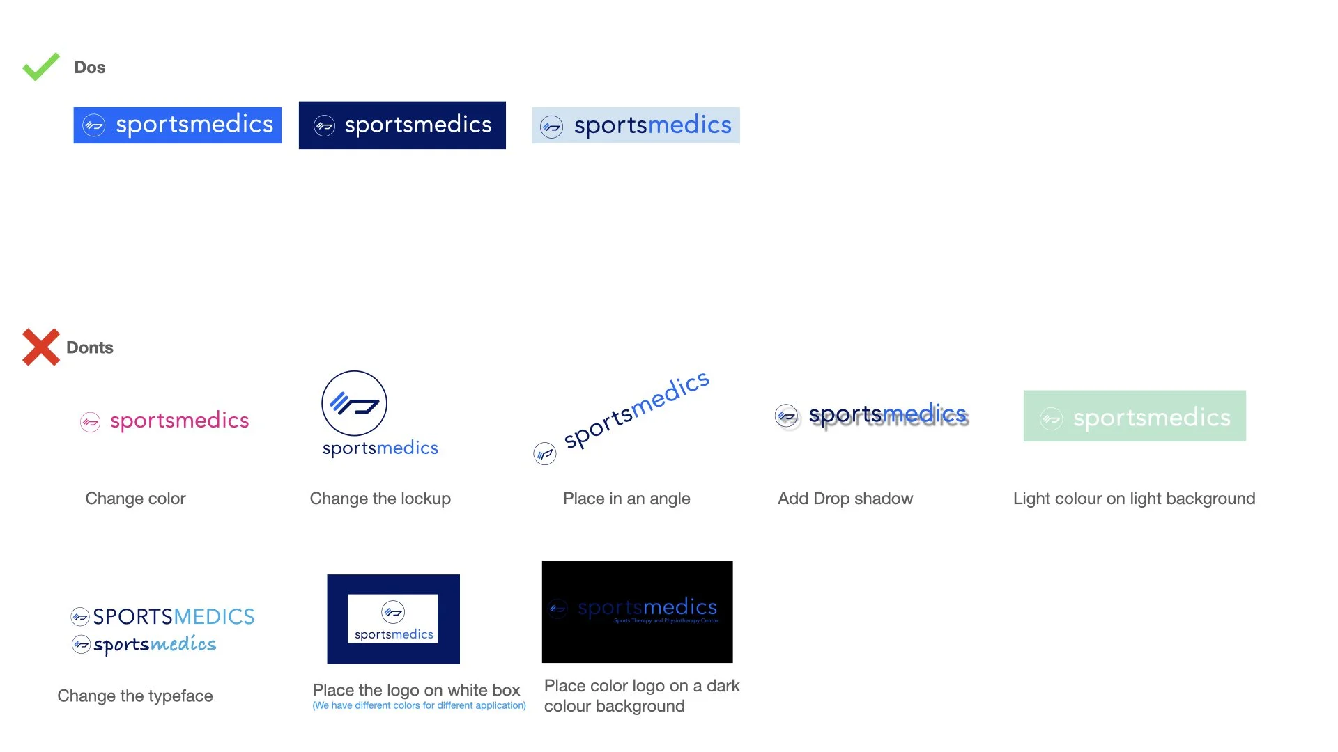
Redesign of their existing logo, with minor changes to improve the overall balance of the mark, and also create a feeling of professionalism.


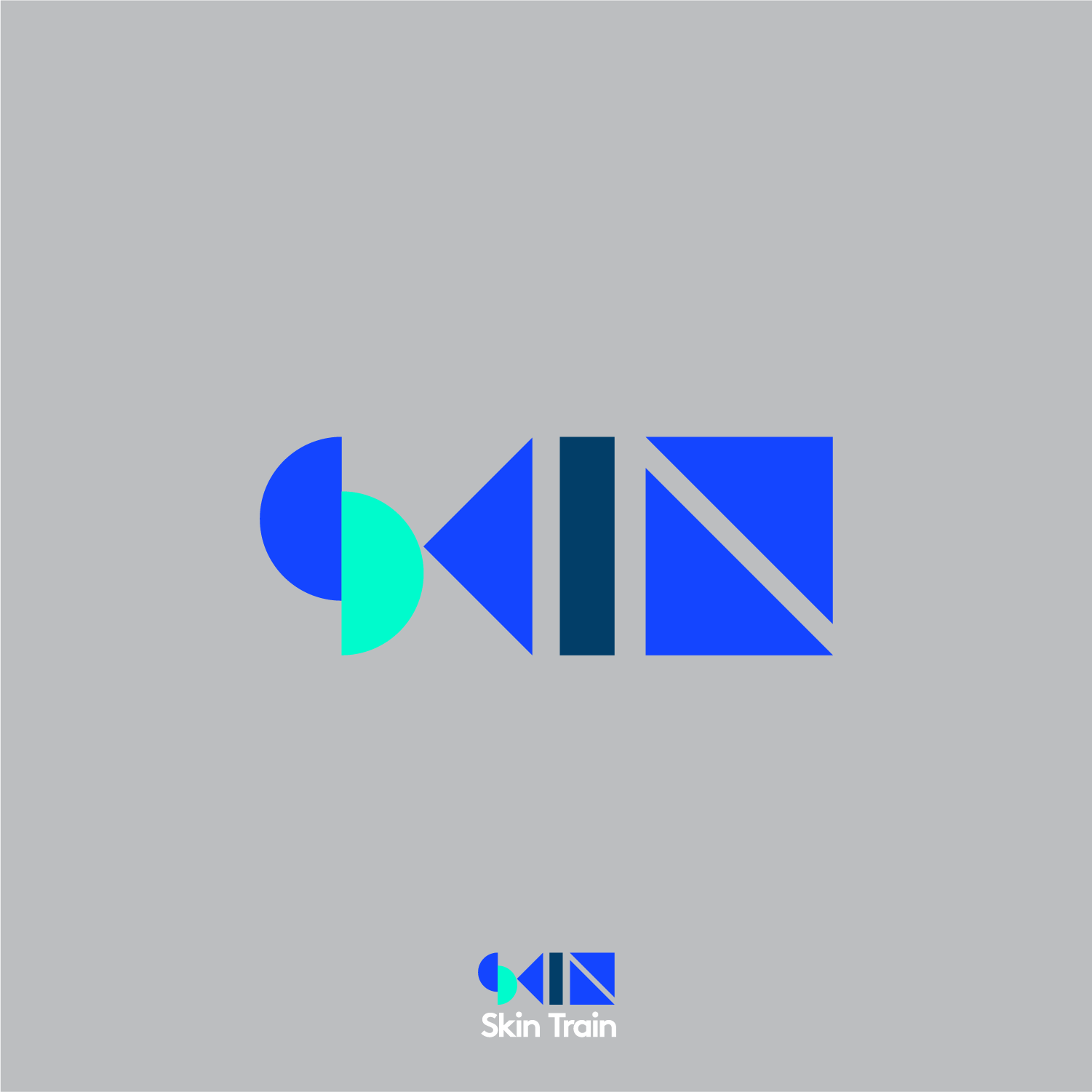
SKIN TRAIN
SKIN TRAIN
A newly established skincare brand in China, targeting Gen Z. A one stop skincare product which also focused in quality.
SKIN TRAIN
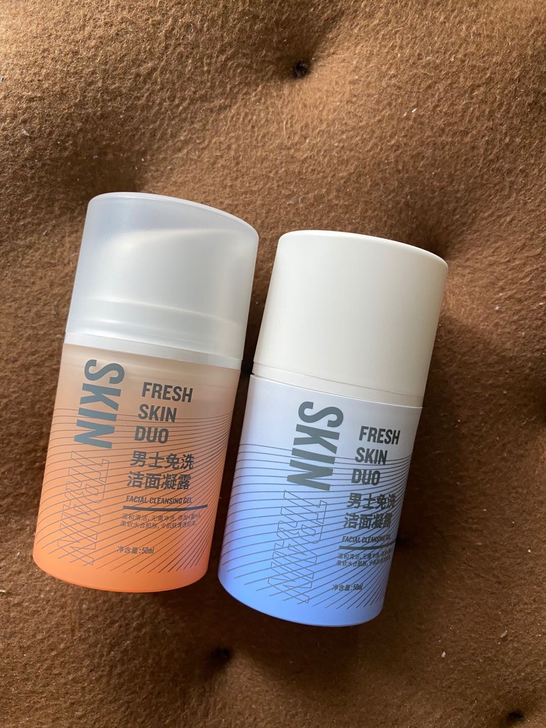
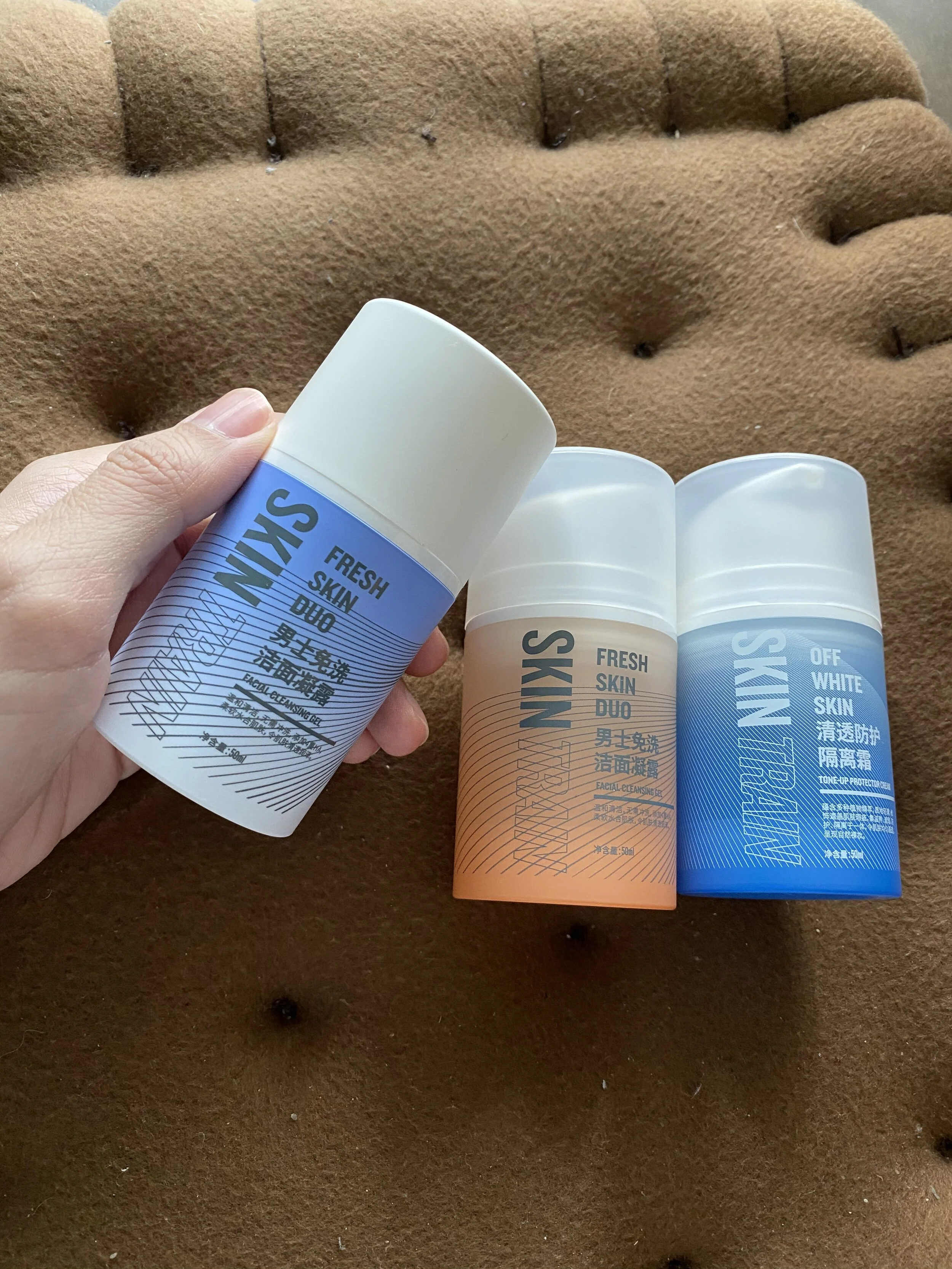
Year: 2021Category: Brand Identity, Packaging DesignFor this skincare brand targeting GenZ, our team created a simple and effective packaging solution that incorporates a stunning gradient of sky blue tones. The design is clean and modern, with a focus on functionality and ease of use. The gradient of sky blue tones reflects the brand's connection to nature, emphasizing the purity and revitalizing power of the sky. The minimal graphics and sleek design appeal to the tech-savvy and environmentally conscious GenZ consumer. With this packaging design, SKIN TRAIN is positioning itself as a trustworthy and innovative solution for men's skincare on-the-go.


Packaging
The colors of the packaging is inspired by the sky. As the brand is focused in sports, the dawn and dusk colors give the feeling of the activeness.


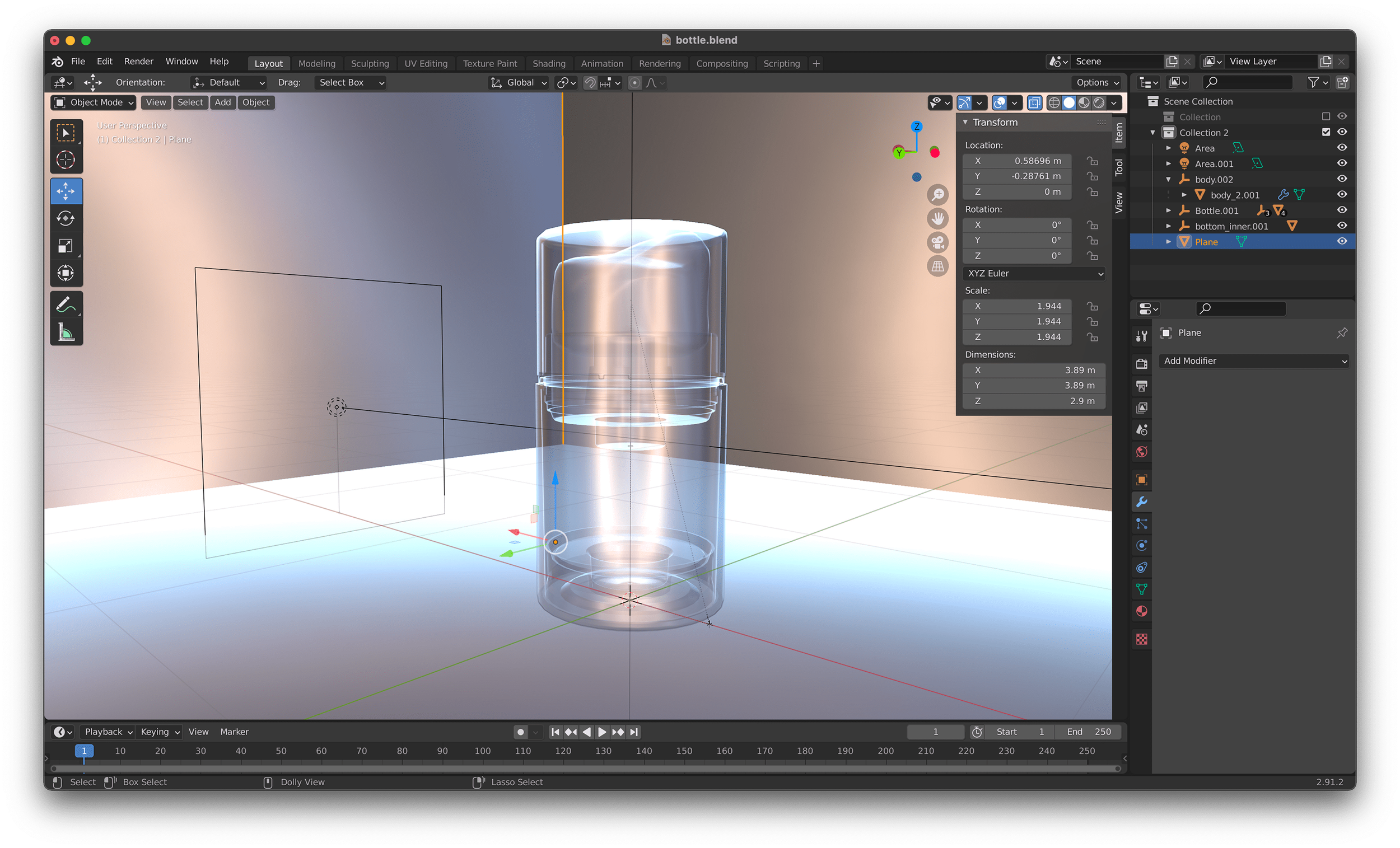
3D Model


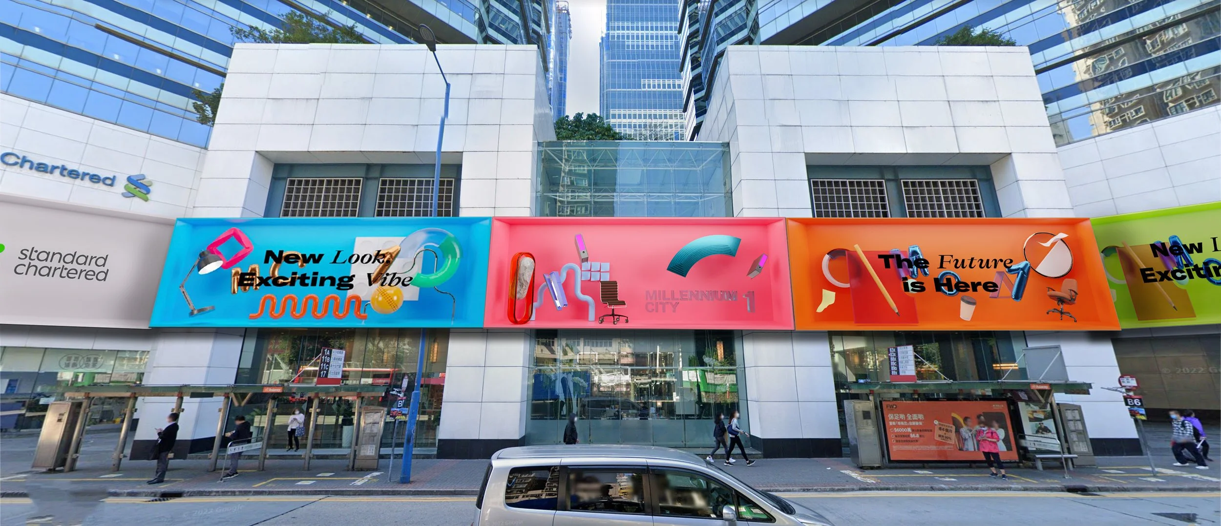
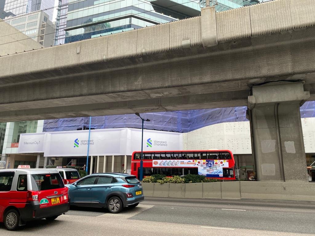
I was tasked with creating a 50-meter wide hoarding design for Sun Hung Kai Properties Hong Kong. Utilizing cutting-edge 3D software and rendering techniques, I was able to bring the client's vision to life and create a truly eye-catching design. The bright colors used in the design bring a youthful energy to the area and effectively communicate the dynamic spirit of the company. The incorporation of office elements emphasizes the building's purpose and highlights its functionality. Our design is not only visually appealing but also serves a practical purpose, catching the attention of people on the bus and across the street, making it an effective marketing tool for Sun Hung Kai Properties.

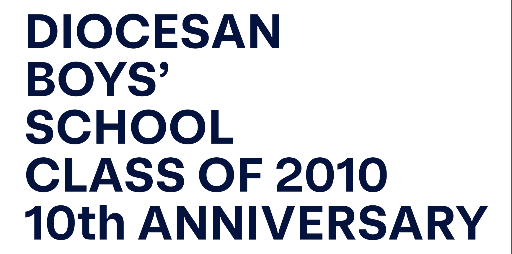
Diocesan Boys’ School Class of 2010
Year: 2021Category: Brand Identity, Souvenir DesignA brand identity for Diocesan Boys’ School Alumni – Class of 2010, from logotype to souvenirs design. for their 10th year anniversary reunion.
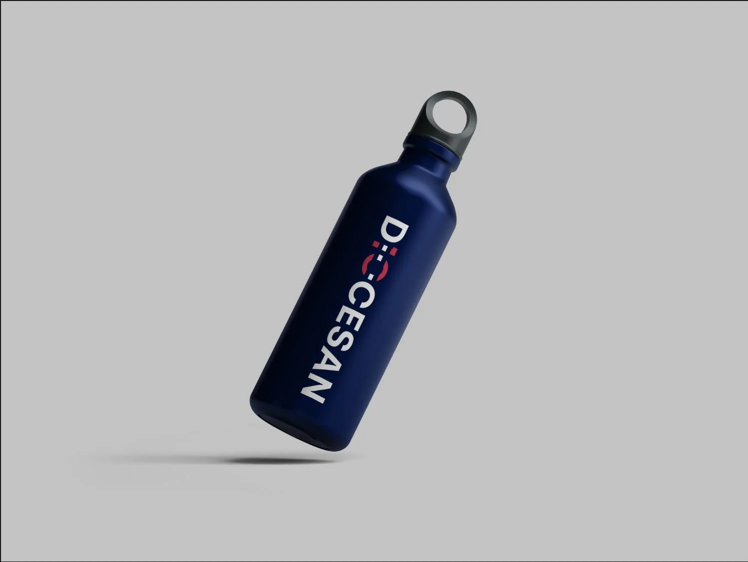
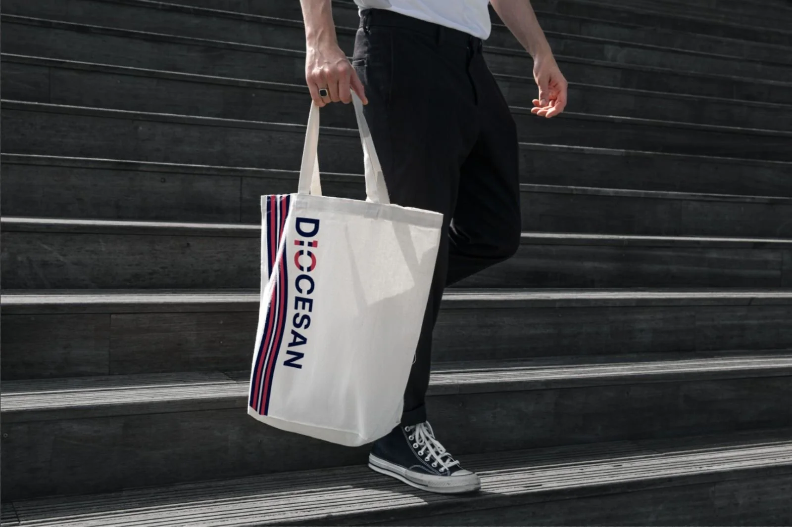
Diocesan Boys' School Alumni Class of 2010 Reunion Branding: For this 10-year reunion, we were tasked with creating a brand identity that accurately reflected the shared experiences of the alumni. Our solution included a custom logotype that seamlessly integrated the word "Diocesan" with the number 10 and applied the design to a range of souvenirs, including a tote-bag, water bottle, and tie. Additionally, our team provided event planning expertise to create a cohesive and memorable celebration experience for the alumni.

Logotype: Combining the school name, with the “10” to represent Diocesan, class of 2010. The stripe also representing the school colour, to differentiate the 10 with IO.
A full typeset of the brand and the event.


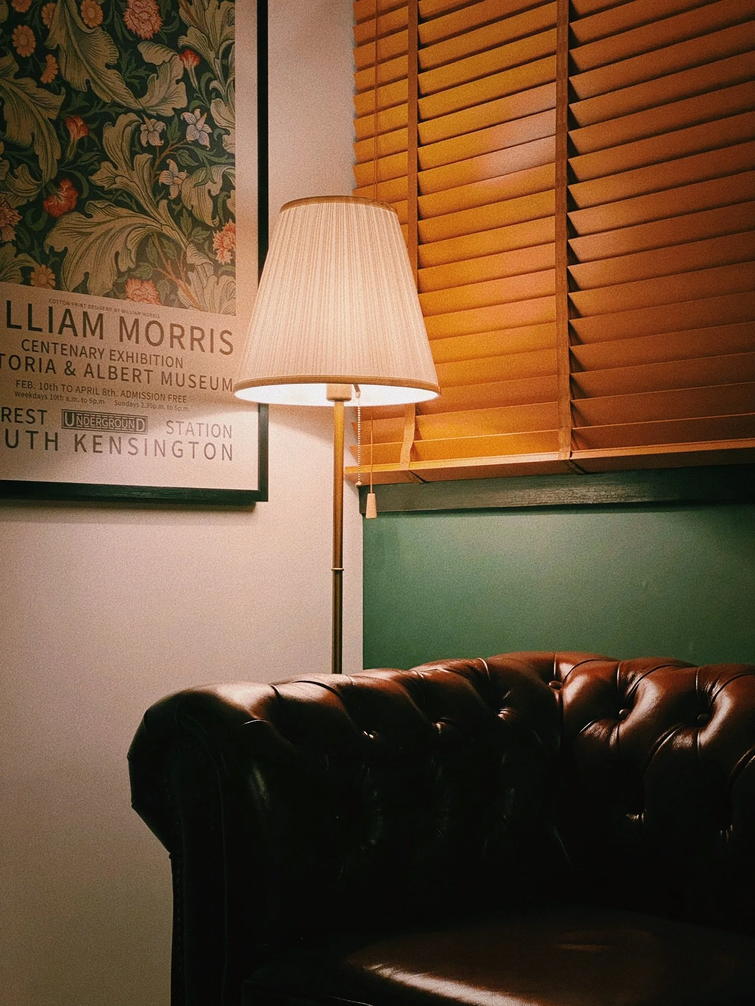
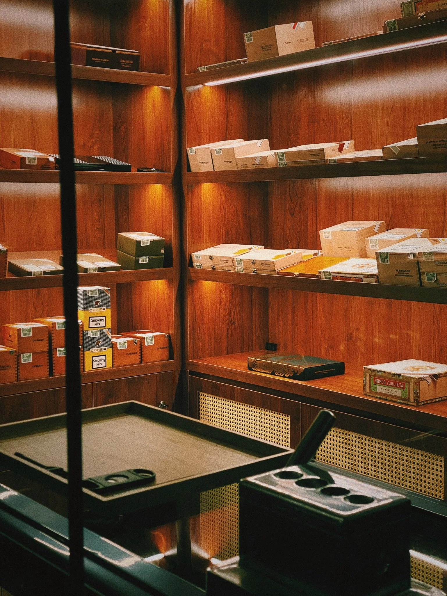
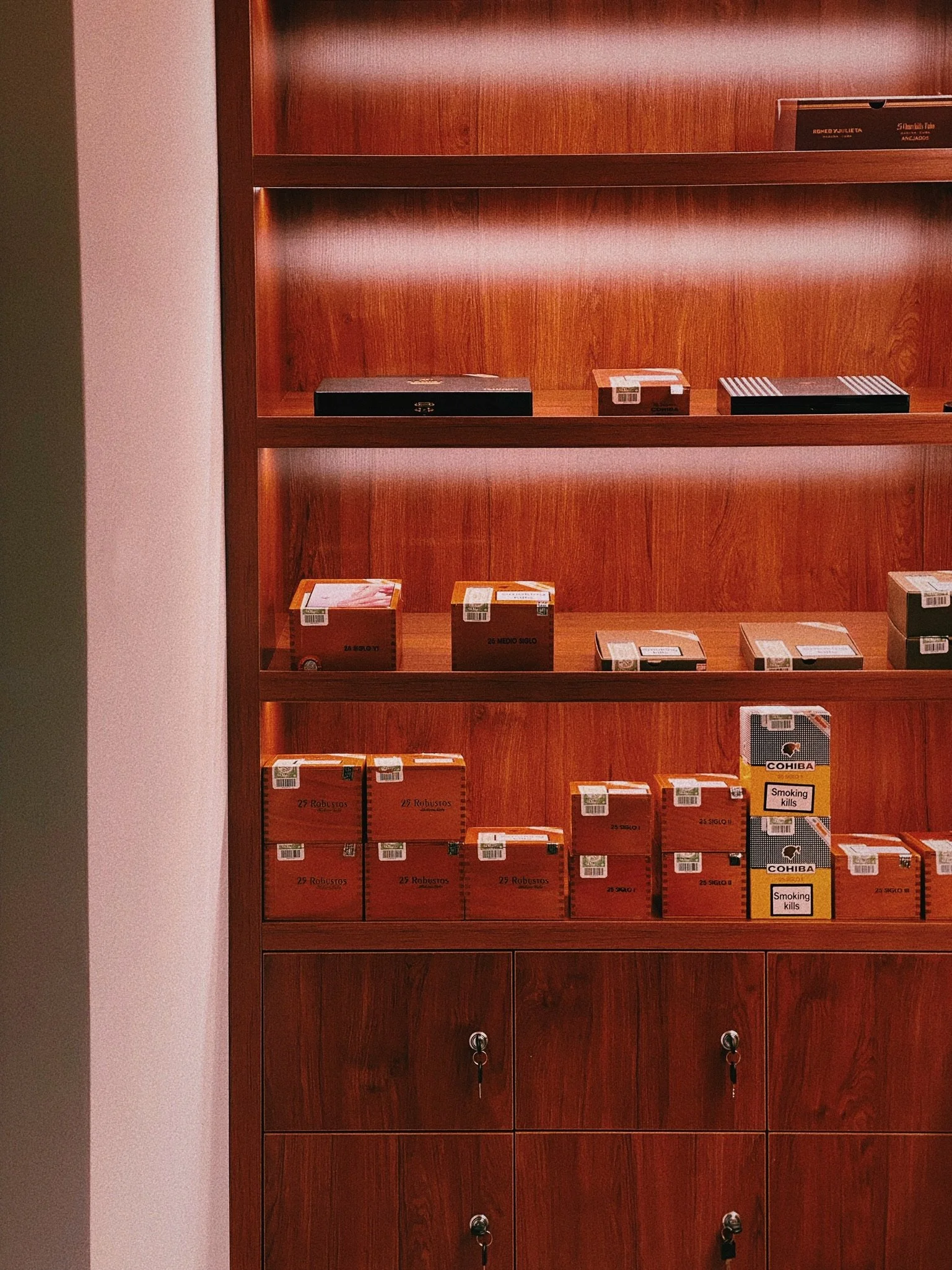
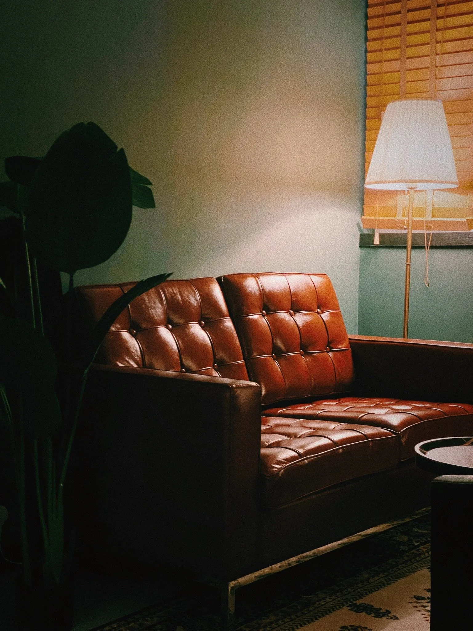
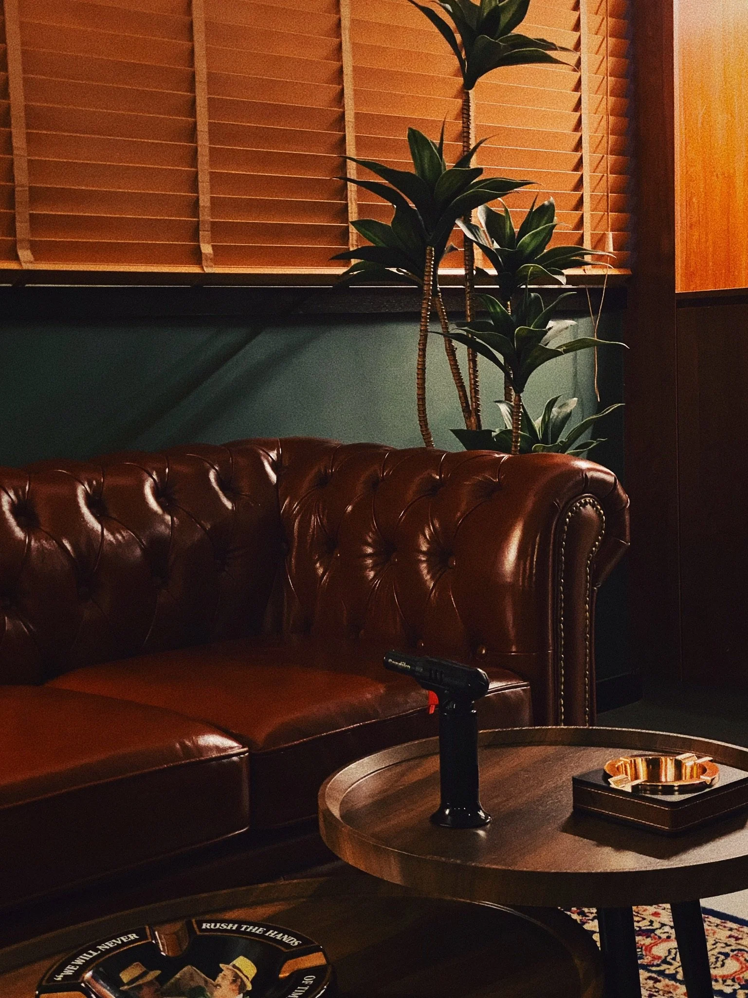
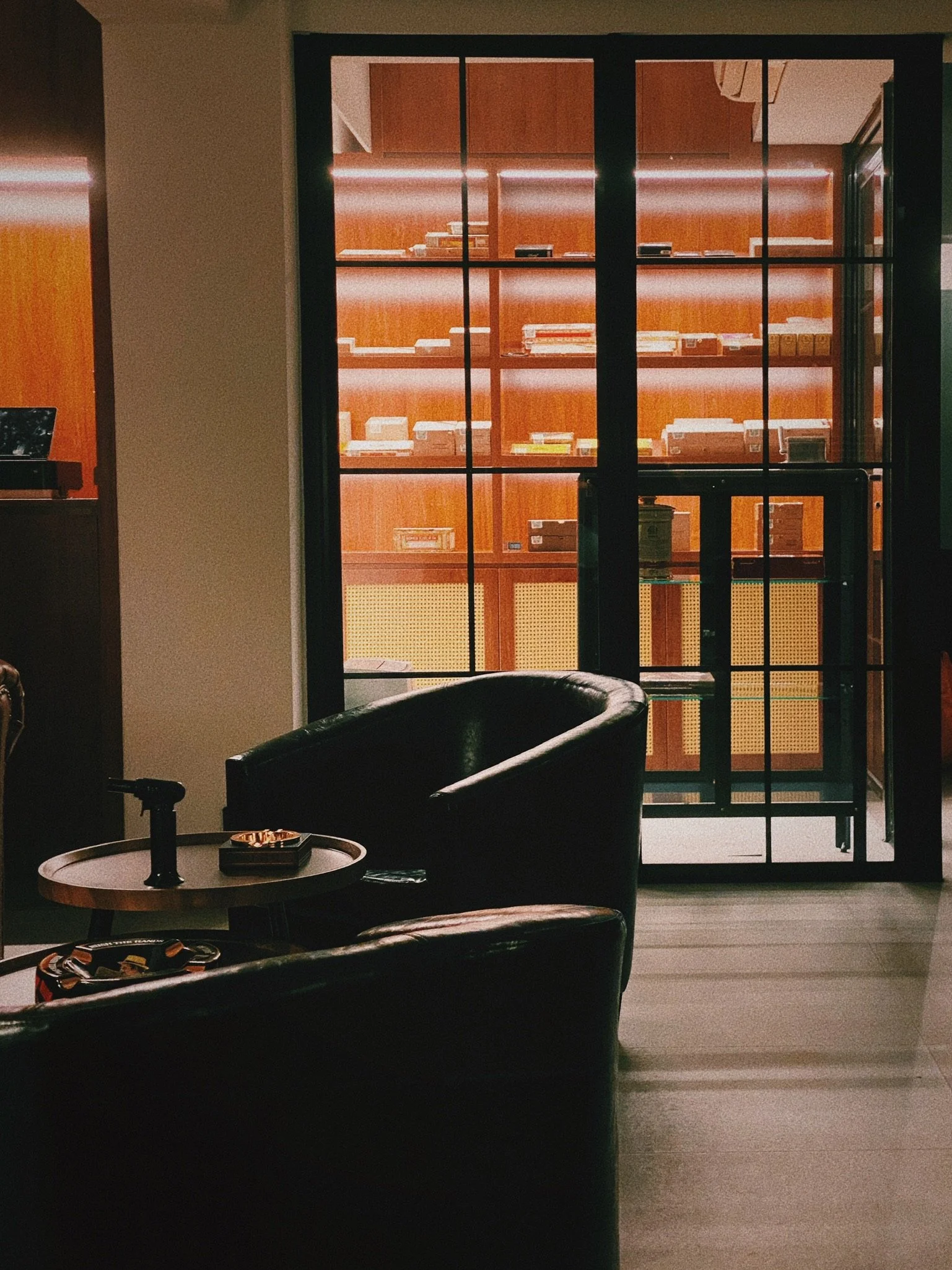
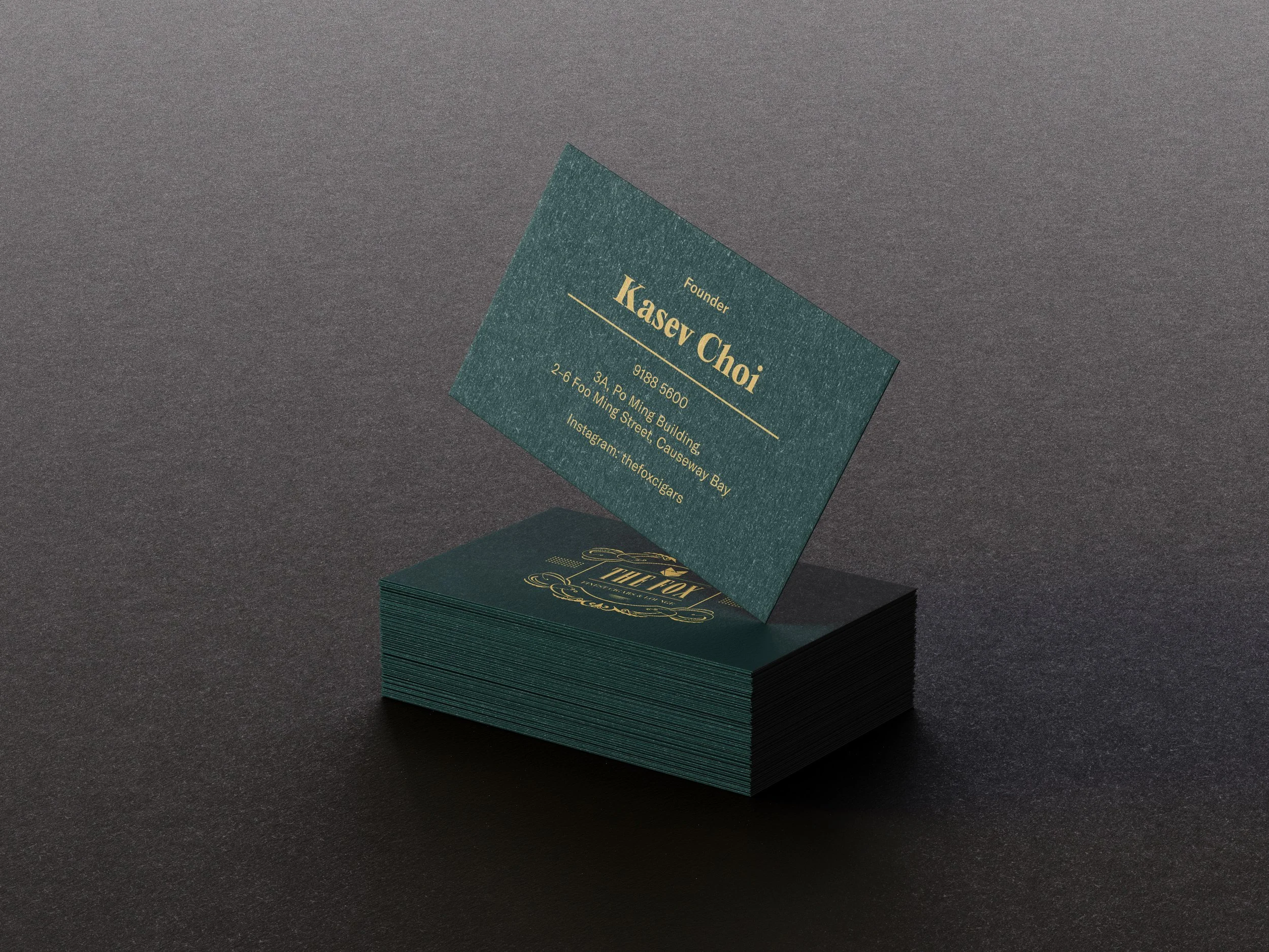
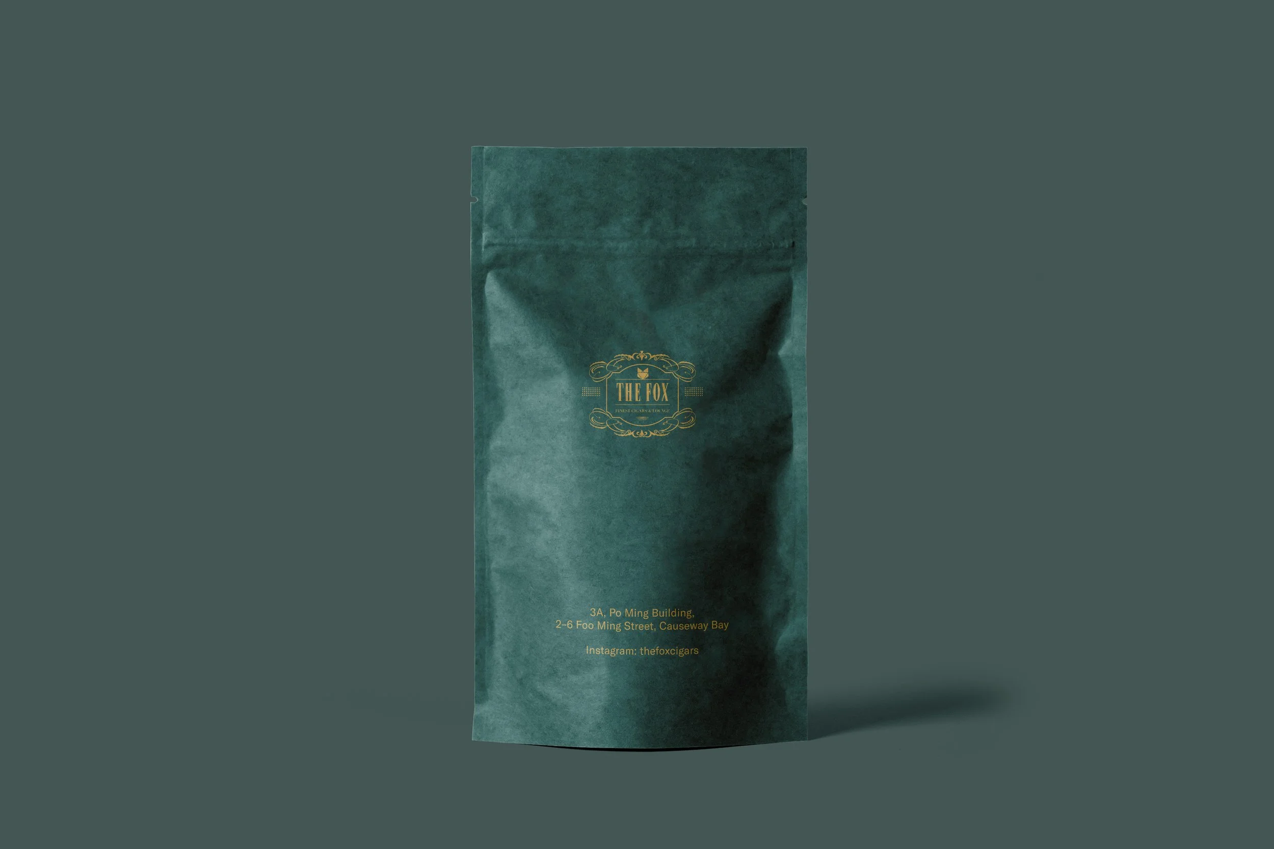
Project: The Fox Cigars
Location: Hong Kong
Year: 2022
Category: Website Design, Brand Experience, Interior Design, Rendering, Art Direction, Photo shoot


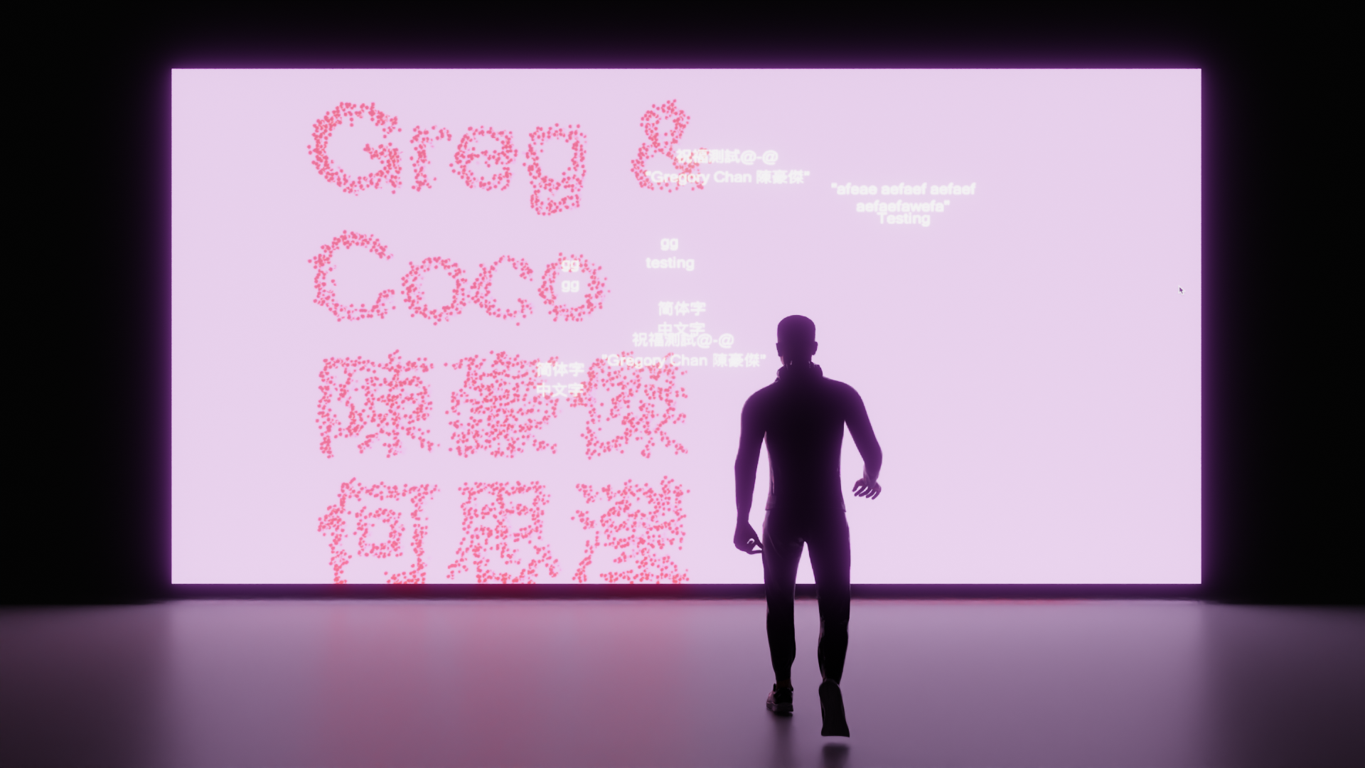
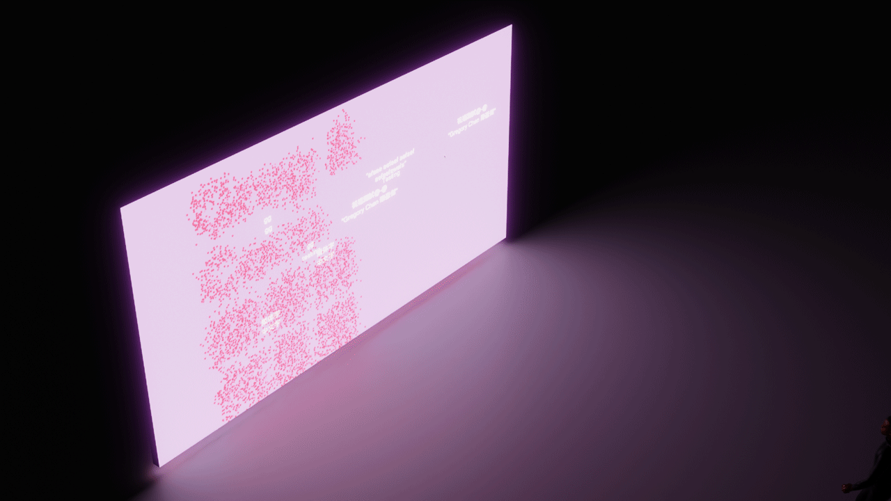
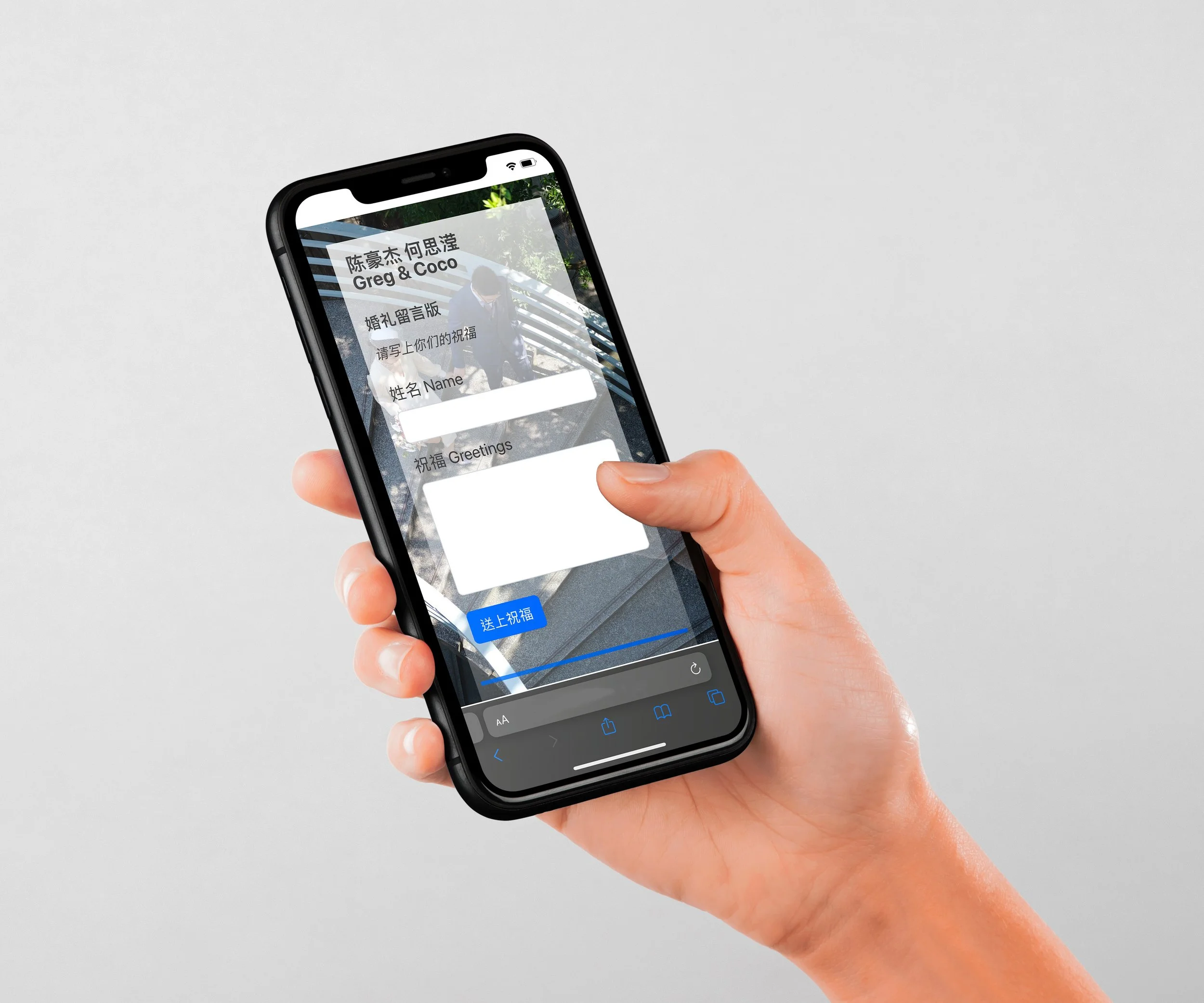
Slow-Particles Interactive Installation for Weddings: Gregory has created a captivating interactive installation for weddings with the theme of slow-particles. As the audience walks closer to the installation, their names appear as individual particles that come together to form a beautiful and unique display. The centerpiece of the installation is a screen that showcases the names of the happy couple. In addition, the audience can upload their messages to the screen via a web-app, adding a personal touch to this already memorable experience. This innovative installation is sure to leave a lasting impression on all who attend, making it a perfect addition to any wedding celebration.
Prototype of the installation, utilizing the depth map sensor to sense the distance of the person, and move the particles into text. Floating text are real-time comment that can upload via a web-app.


Pit Garage Los Angeles

Logo Redesign
I was tasked with giving a long-established racing garage in Los Angeles a fresh and modern look. With a focus on the garage's passion for all things racing, we created a bold and energetic rebrand that captures the speed, power, and excitement of the motorsport industry. The new visual identity is rooted in a dynamic color palette and sleek typography, with elements of speed and motion woven throughout. This rebrand not only sets the garage apart in a crowded market but also perfectly aligns with its core values and mission, making it a true representation of the garage's commitment to excellence.


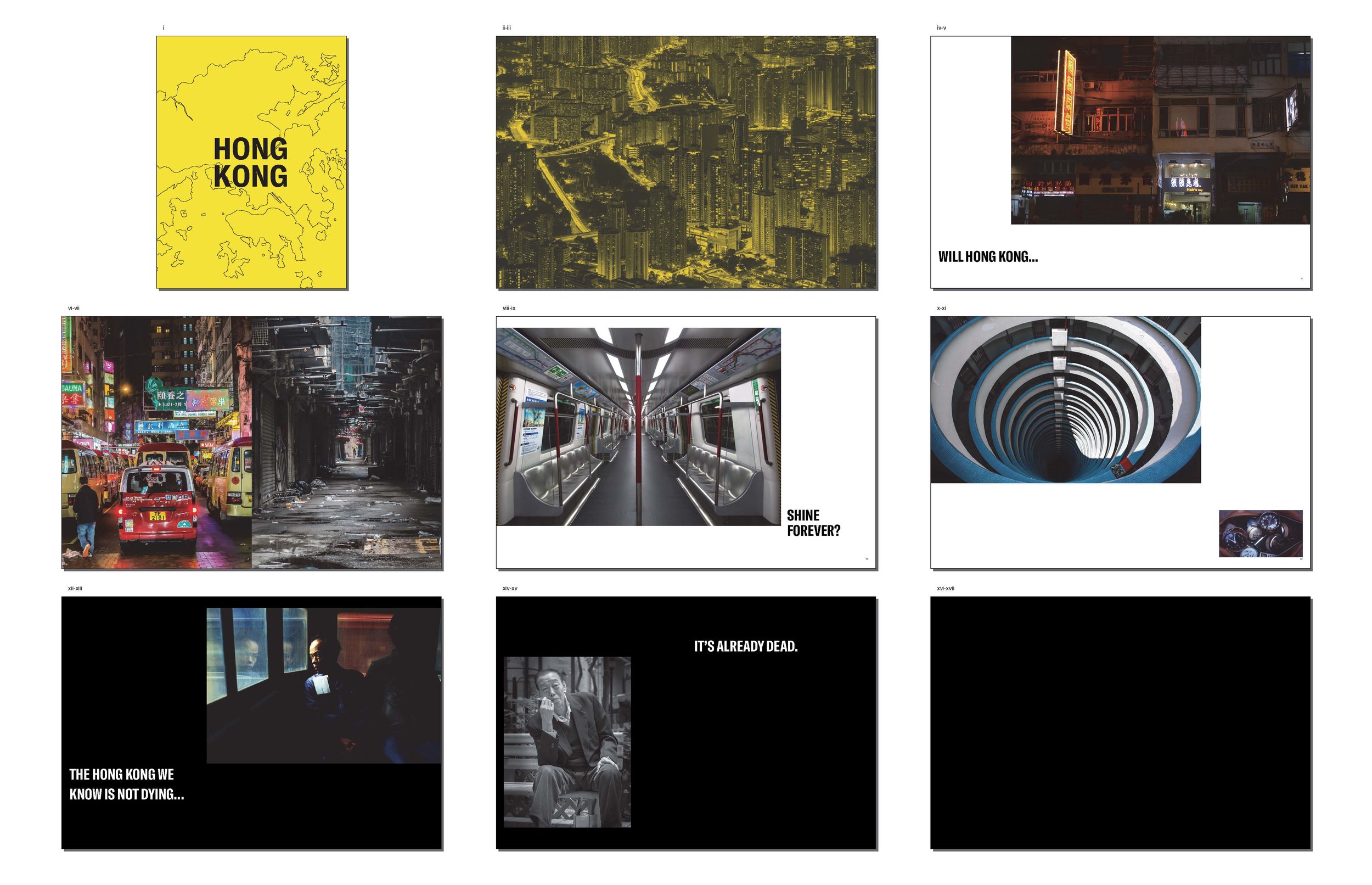
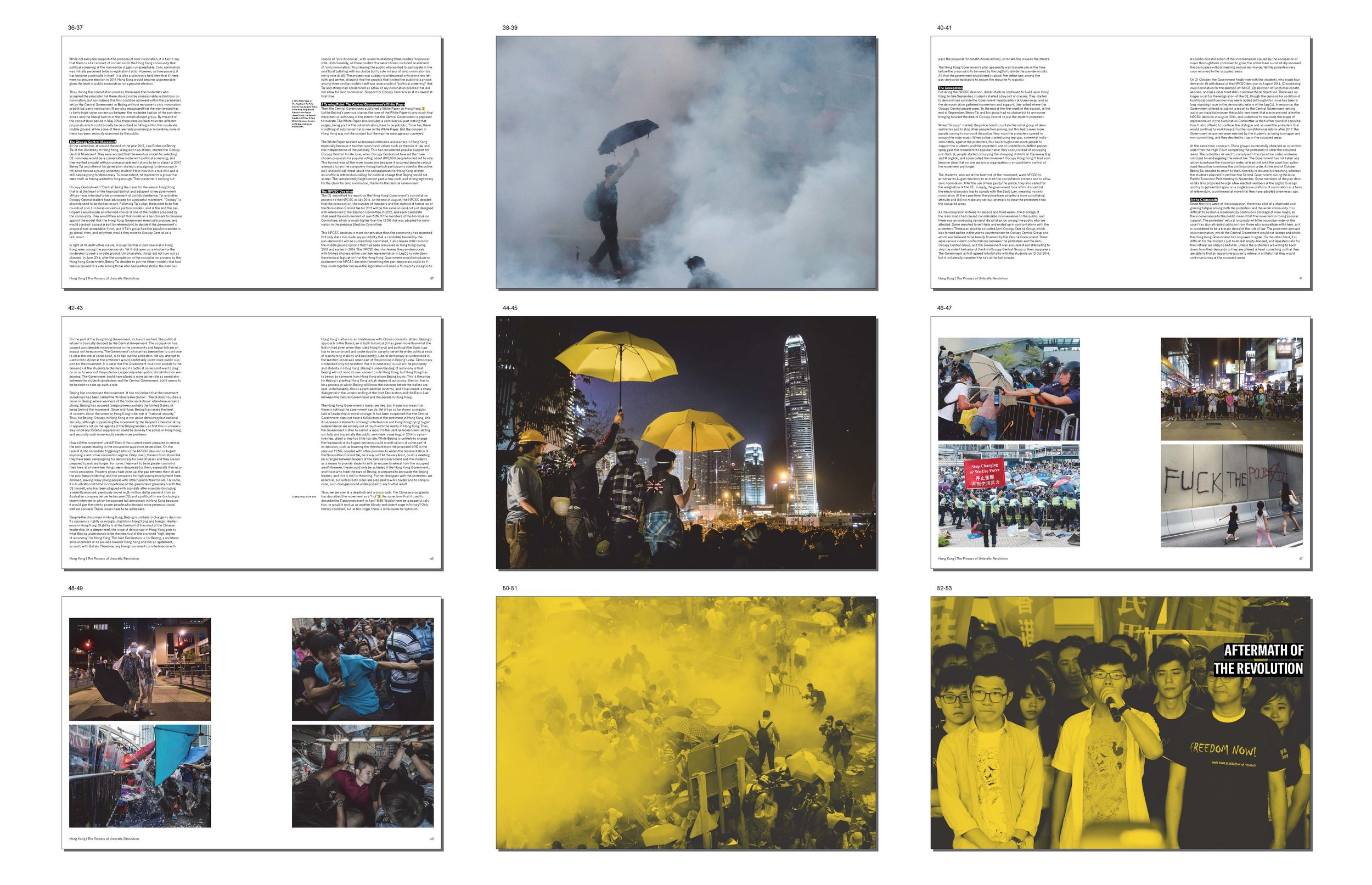
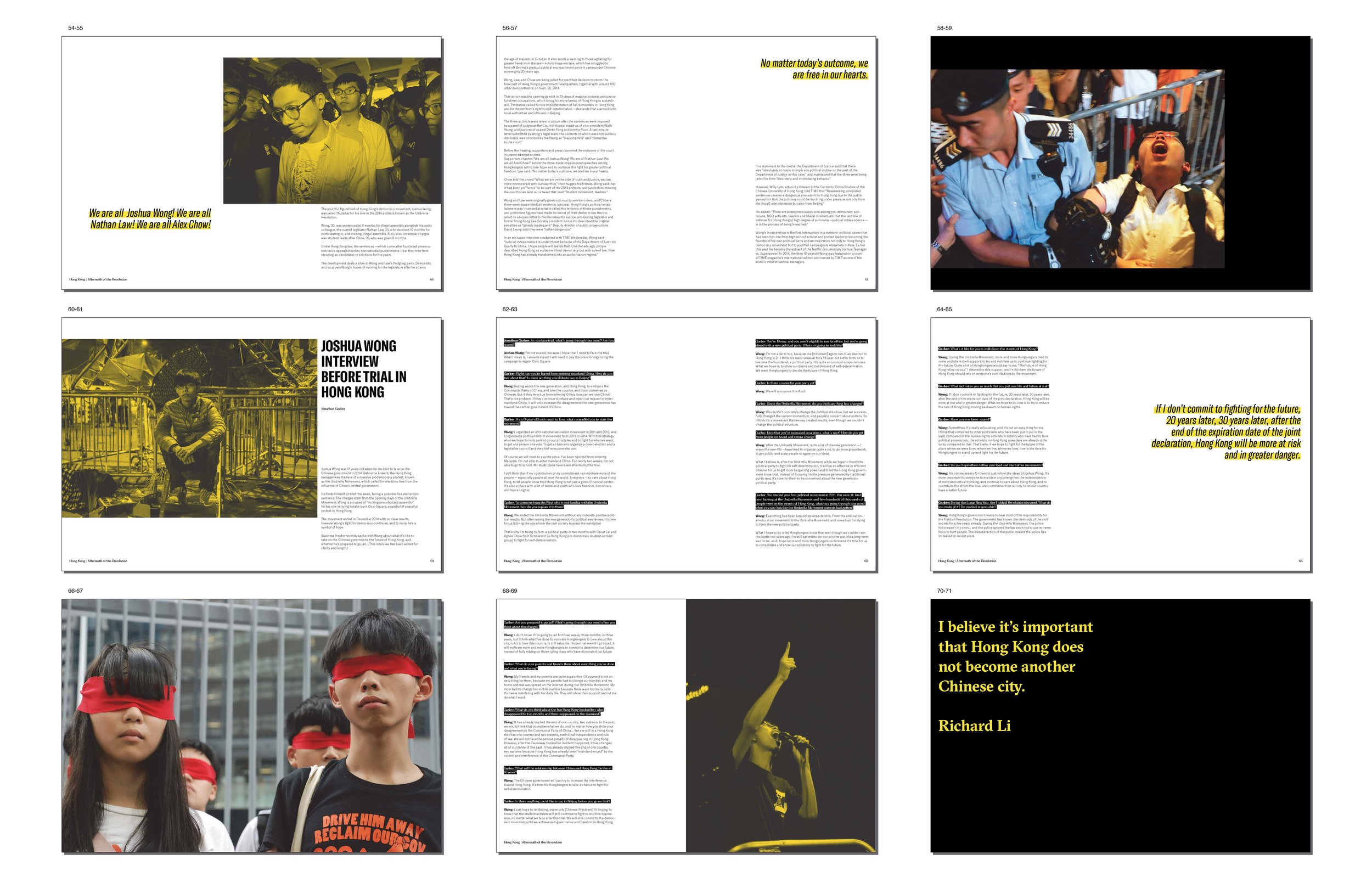
Hong Kong, 20 Years of Struggle
Was tasked with designing a book that sheds light on the struggles faced by the people of Hong Kong in the 20 years since its return to China. The book provides a unique perspective on the challenges faced by the city and its people, with a particular focus on the hopes and aspirations of the youth. To complement the book, we created a supporting interactive installation that set the tone for the release. This immersive experience gave the audience a deeper understanding of the issues discussed in the book and provided a powerful visual representation of the challenges faced by Hong Kong. This project was a significant and impactful way to commemorate the 20th anniversary of Hong Kong's return to China.


“If you show the umbrellas on film, the government will say, ‘NO WAY’.”


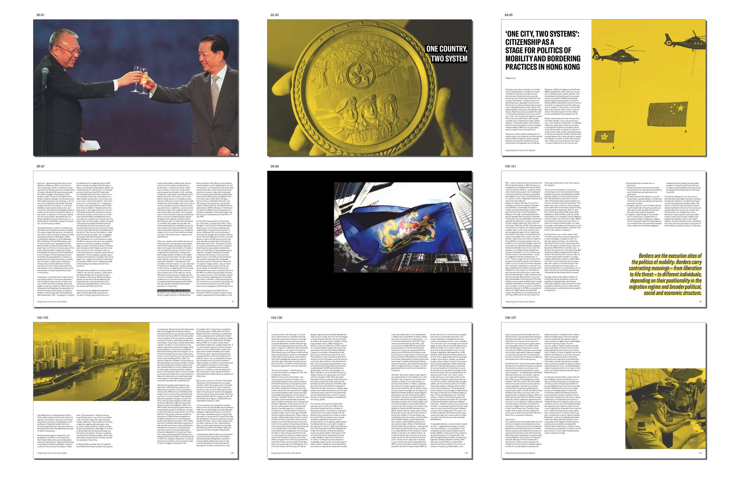


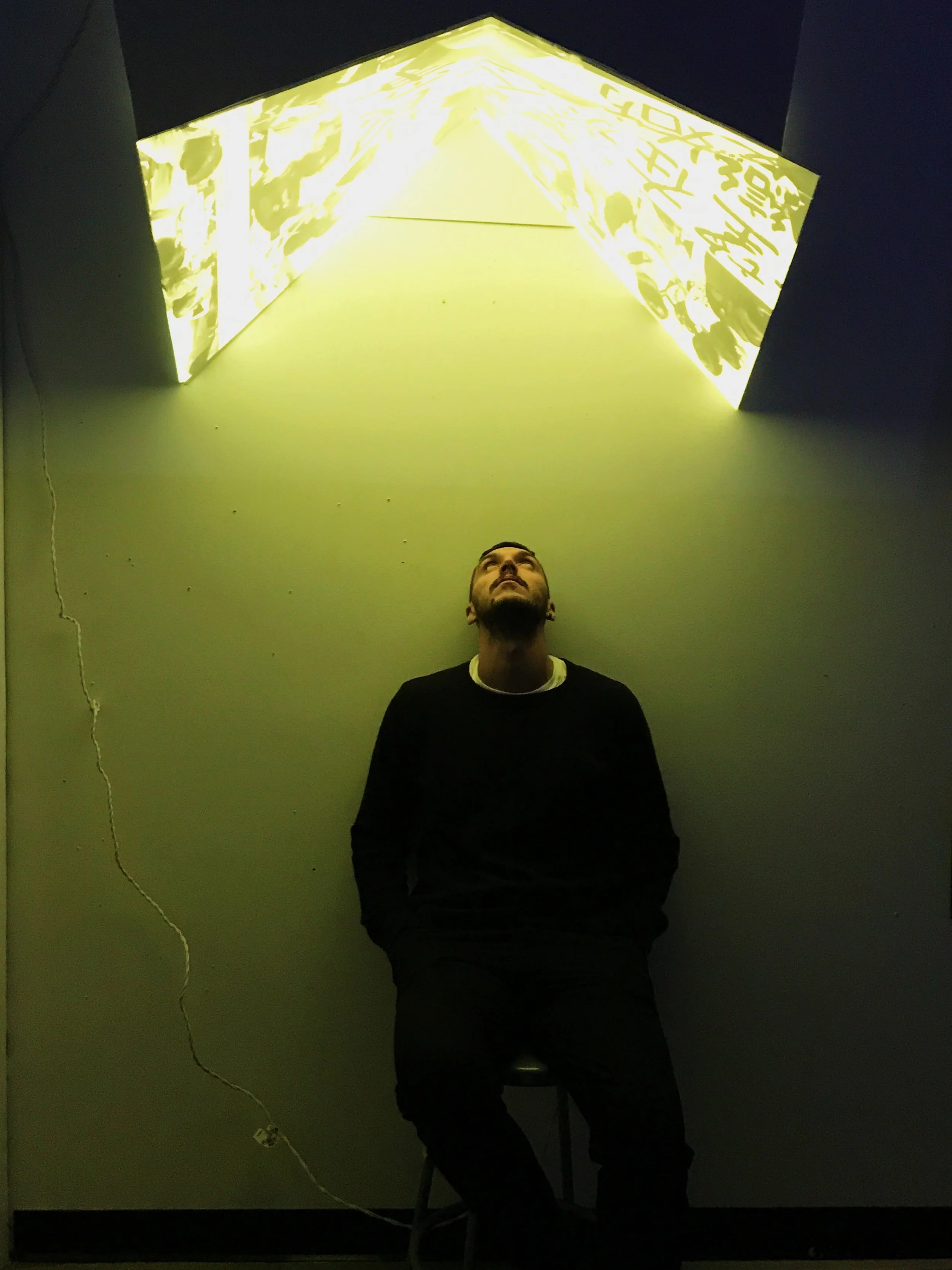
Hong Kong Umbrella Installation
The umbrella revolution occurred in 2014, the installation is paired up with the publication which is about the 20 years after the handover. The installation majorly shows the protest, as the students use umbrella to protect themselves, therefore the shape resemblance the form of a umbrella. In order to activate the installation, the audience need to sit under the form to experience the video.

Audience stand underneath the installation
to experience the protest of Hong Kong, and having the feeling of protected by an umbrella, as the outer part of the installation is having yellow rain. The emerging feeling support the information of the book, therefore to give you the first-hand experience.
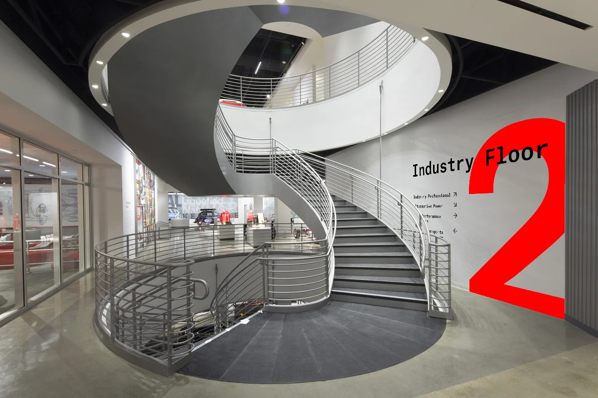
California Automotive Museum
Rebrand of the Petersen Automotive Museum, creates a interactive identity and celebrates the facade of the museum.

Logo
To understand the current needs of the museum, I have conducted visits and observations. According to the observations, it is identified that visitors always bring their partners or family to visit. Providing the interactive element to the museum, can attract the non-car enthusiast to understand the topic easier. Changing the name to California Automotive Museum, celebrates the car culture in California, also as CAM can refer to essential engine part, which is the camshaft.


Identity Poster Series
The New identity posters celebrate the sound and history of race cars, bring up the reason why car enthusiasts love these so much and the reason why we think they are art pieces. The typography is representing the actual engine sound of the car at the background.


Exhibition Poster Series
Japanese Neo Classic is defined as the 80s and 90s Japanese automobile. When we think of classic car, we tend to think about American muscle cars or Europeans. The audience of the Japanese Neo-classic is almost the same age as the automobile, who love these cars during their childhood and wish to own one. The early computer drawn shapes are one of the iconic feature of the Neo-classic, and also the advance technology car manufactures put into these cars.
Data Visualization Poster
Car enthusiasts can identify different cars by the sound of the engine. Visualizing the sound wave explains why they can do so. In the poster are 3 different V8 engines, from different decades. This is a teaser for the installation for the museum.


Metro Music Festival
A 3 days music festival held along the Metro Rail. Discover a new part of the city along side with music that you love.

A campaign for Los Angeles. According to research, young population in Los Angeles tend not to take the Metro, and the demographic of the Metro is limited. Since Los Angeles has a large music industry, which can give a positive vibe to the young population.3 days music festival with different genre of music located at different Metro stations, to promote the Metro itself, and encourage the audience to take the Metro in order to attend all the events.


Poster Series
Promotion posters for the event, and hafving information of the location. Different color represent which Metro line it will happen along with.
